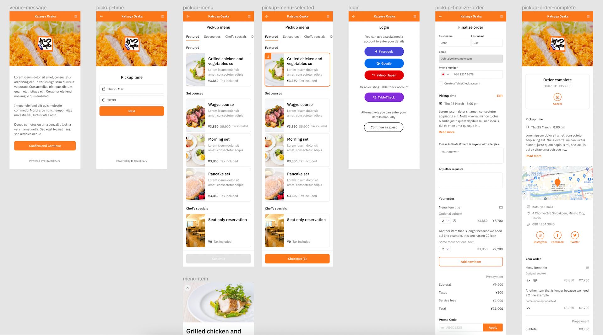
TableCheck's new Booking Form

TableCheck's booking form is incredibly comprehensive. The amount of settings that merchants can configure is mind-blowing. For most restaurants, especially in western cultures, there's no need to request a lot of details from diners. In fact, everyone would agree that it'd be counterproductive to do so. But in Japan, omotenashi is very important, hence most restaurateurs would like to go the extra mile to make sure their guests' expectations are met. Unfortunately, this involves requesting a lot of details during the booking process. Although this is something that TableCheck eventually wants to fix by providing user traffic data to merchants and letting them know how a long booking journey impacts their booking conversion rate.
At the same time, the old booking form was previously built on Ruby a long time ago. The platform was getting old and required an upgrade to React, so merchants could embed it on their websites and apply their branding to provide a great UX and DX (Dining Experience).
Given these requirements, my team and I were tasked to come up with a new design, prototype and eventually an MVP. The process took longer than everyone expected (mostly due to design changes along the way), but we eventually released the MVP and some clients started using it in production.
My involvement in the project changed during different phases, mostly because I had to attend other projects. But overall, I can say that I contributed significantly, especially in the prototyping, general mobile and desktop UI/UX coding of the journeys, theming, routing, widget SDK, demo app, waitlist and initial project management areas.
Going forward, the team wants to continue implementing new payment gateways, keep polishing the UI/UX and start getting data on how users interact with the booking form to understand which parts need further improvements.