Royal Opera House website case study
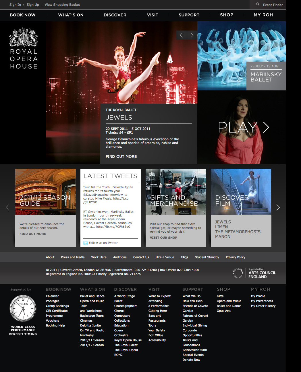
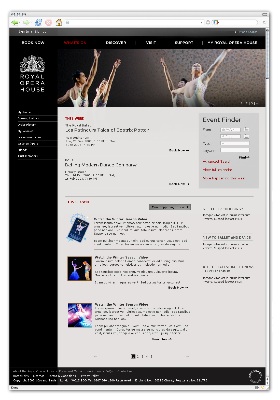
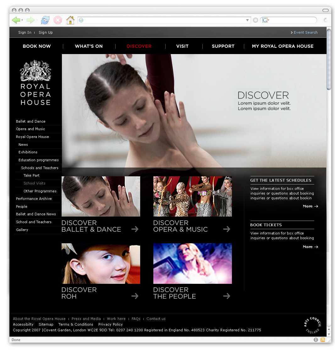
The Royal Opera House was my first professional experience in the UK. I was hired as a Digital Developer by the Design & Development Manager (former lead designer of BBC programs) with a very important objective: to completely rebuild the ROH website from scratch. A business critical project that required a major overhaul in the online ticketing system, server infrastructure, information architecture, user experience, content management and an online shop to match the high standards of the organization.
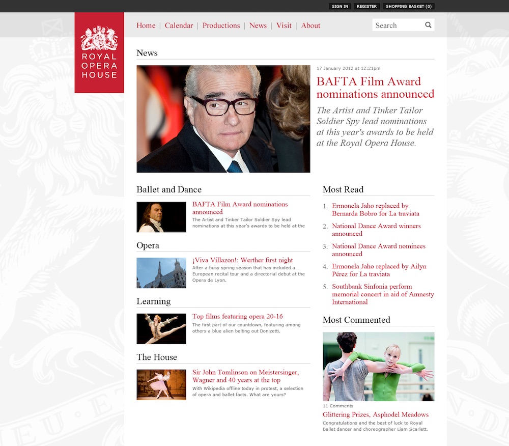
Once we understood the issues with the old website, we decided to start building the news section, which is quite an isolated piece that could be driven by a WordPress installation with a custom theme and plugins.
The requirements and the plan
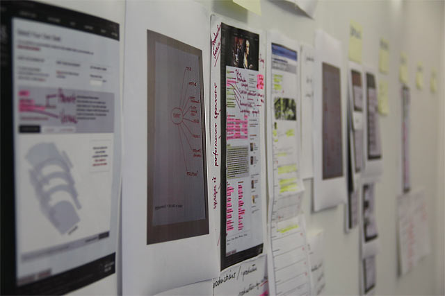
While we were working on the news section, we continued exploring and learning about the organization. We followed a domain-driven design approach, which it's a very effective way to understand the needs and requirements of the many different departments and units that work within the institution. Things like the navigation or page hierarchy are very political topics and building the correct information architecture can take some time...
On the other hand, one of the main issues with the old website was the waiting room. The ROH sells its tickets very quickly. As soon as they are available to purchase, thousands of customers will go online to buy them. This situation was creating a bottleneck in the infrastructure and users were having to wait online for long periods until they were able to purchase their tickets.
The new website would have to address that issue as the main priority. To do so, we partnered with Pop, a digital agency based in the US. They had a lot of experience with Tessitura, the software that many theatres around the world use to manage the box office and their network, so they were the perfect partner for our project.
The agreement with Pop was that they will take care of the Tessitura API and checkout journey (including the seat selection and payment gateway) and we would take care of the rest. The actual bottleneck was in the Tessitura database. It was huge and slow. We needed to decouple the website from that DB if we wanted to have a smooth experience.
At this point, another developer joined the team. We were now three! still a small number for a project of this size, but we had 100% dedication and direct contact with stakeholders, customers and other members of the digital media department.
Framework and infrastructure
Once we understood the problem, we studied the different open source PHP frameworks out there to build the rest of the website. Although the static pages we decided to build them with WordPress. Why open source and why PHP? Well, the ROH is partly funded with public money and we believed in Open Data, Web Standards and making things as open and accessible as possible. I remember that Zend, CodeIgniter or Symfony were the most popular at that time, so we decided to go with Zend due to its robustness and huge community. We also decided to use Doctrine (Symfony's ORM), Apache, Linux and MySQL. A classic LAMP stack.
For the infrastructure, we started with Rackspace but soon moved to Amazon AWS elastic cloud. This would allow us to scale the website during the ticket sale days to allow more traffic and make the purchase experience more enjoyable. At this point, we knew that we were going to have an API to access data from ticket prices, event dates, etc, but not all the data we needed! The API was going to give access only to a subset of data related to tickets and events. We still needed to access data related to productions, artists, season calendars, etc. To get hold of this data, we came out with a plan: to implement MS SQL triggers in the Tessitura DB that will update the data in our MySQL DB. This means that we designed our own MySQL database, with tables like 'productions', 'events', 'people', etc, and the data of those tables will be updated automatically from the main Tessitura DB. Awesome! The theory was great, but the practice turned out to be a bit complex due to firewall restrictions, ODBC connectors and writing some complex SQL queries. Nevertheless, we were able to set it up and it felt great to see it working.
The Internet as a CMS
Another interesting topic was imagery and video management. The ROH is an Art organization and the audiovisual documents are very important. We needed an inexpensive system, scalable, social media are friendly and easy to work with. We decided to use Flickr for images, Youtube for videos, SoundCloud for audio and Delicious for related content.
Here is where I learned a very important lesson from my team leader... "We have to use the Internet as a CMS". This line resonated with me for years and I used it several times later on in other projects. It's so powerful and meaningful. At first, I wasn't confident about it. I wanted to have control and host the files on our server. But then I realized the benefits of delegating this task to someone who is the best at it, like Flickr. They had a strong and well-documented API, an automatic cropping system, and a huge audience! These sites don't disappear in one day, why should we worry about it?
So we customized a Flickr WordPress plugin (for the news section) and created a small admin area to allow the content team to update the homepage imagery. The rest of the pages with dynamic data (events, productions, seasons, etc) were using images and videos coming directly from the Tessitura database.
Less is more
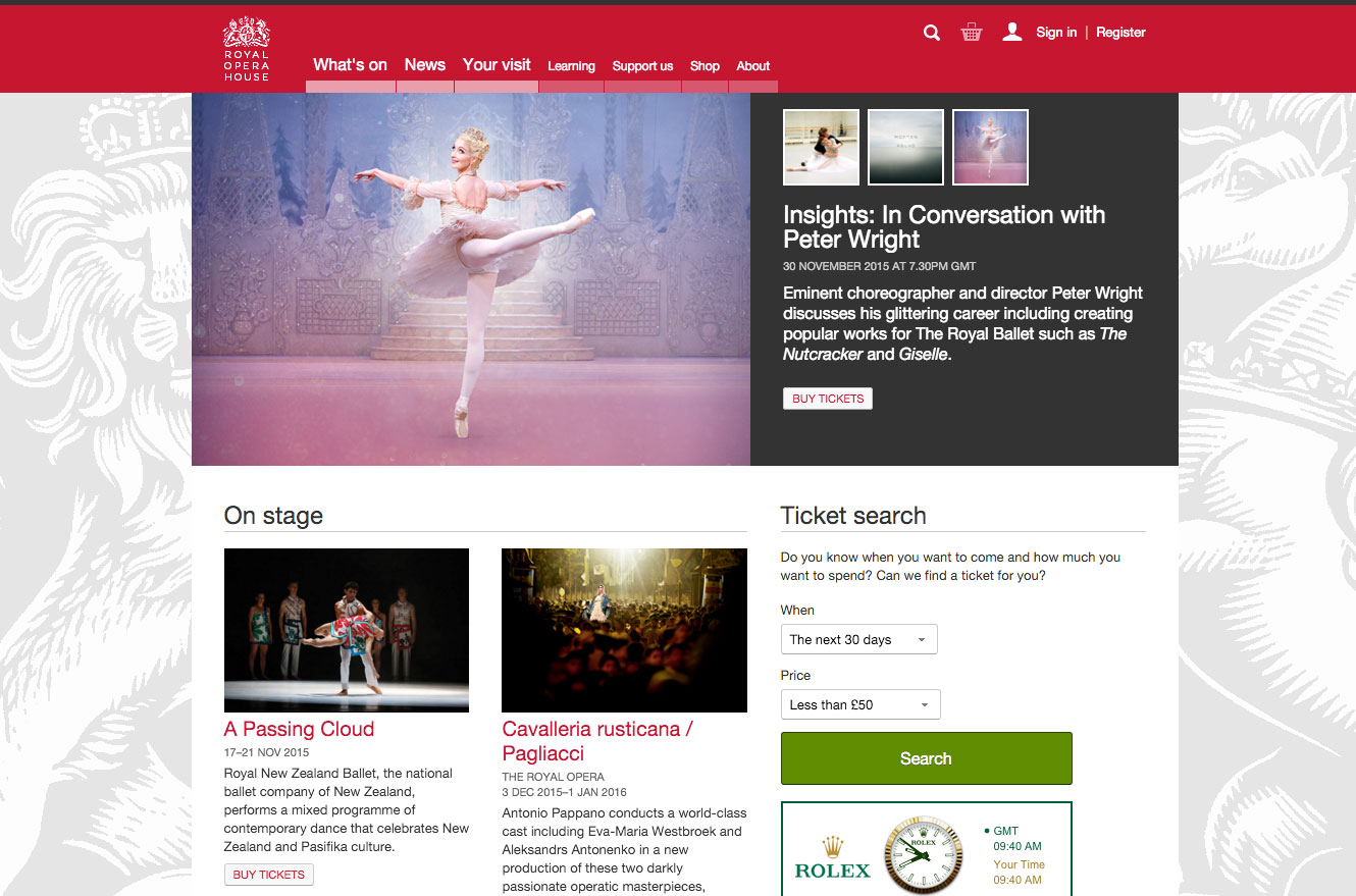
Another lesson I learned in this project is about minimalism and simple design, or how is commonly known as "less is more". The best example is when we were discussing adding social media icons to share news articles. Having a personal blog and knowing the benefits of having those buttons, I was convinced that the same principle would apply to the ROH website but I was wrong.
By looking at the iOS interface, I realized how easy and clear interfaces make a better UX. At first, I thought that it could come across as some sort of 'institutional elitism'. For example, "I don't put social links because I don't need them and that's something small blogs do". But then I realized that this decision has more to do with the target audience's habits and favoring an easy UX. This approach has also an SEO benefit due to users having to come back to the website to continue their conversation about a story.
Open Data
I would also like to talk about the API system that we built to open the ROH data. It seemed like a great idea at that moment. What we did was implement lots of different formats (XML, JSON, RDF, RSS, ATOM, ICS) and hackable/semantic URLs for the website content.
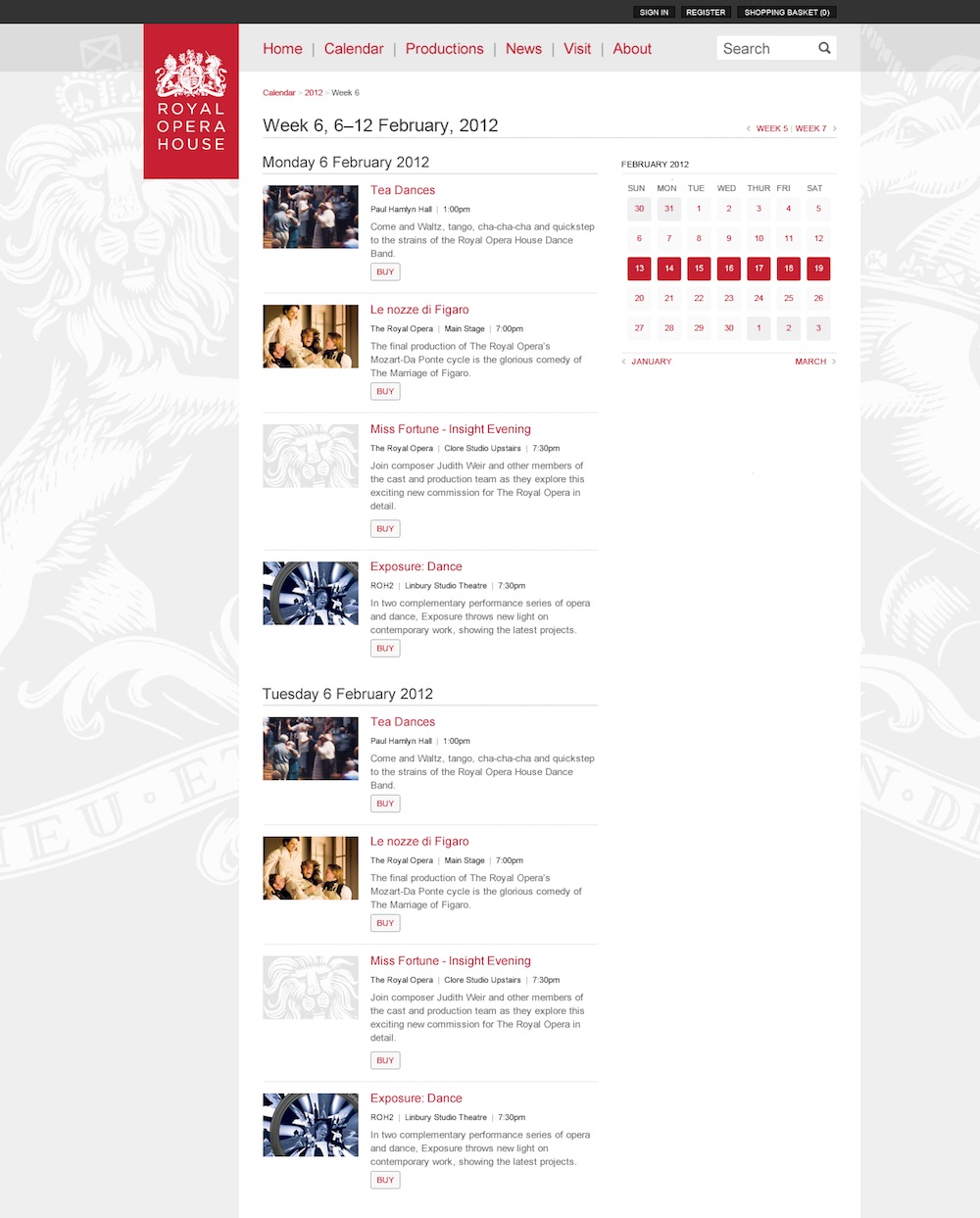
As a user, you could get news stories in many different formats. Not only the article, but the categories, archive, most read, most commented, etc. You could also download the events calendar (a particular day, month, week,...) in the ICS microformat. The events and production data were also available to be consumed in JSON or XML. It was mainly a system to allow people to consume the ROH data in a machine-readable manner. All you had to do was to add ".xml" or ".rss" or ".json" at the end of the URL. This idea follows what was implemented in the BBC programs.
Conclusion
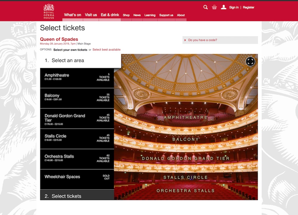
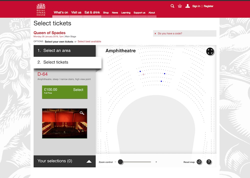
There are many interesting topics that I could continue talking about, like the global search, consistent tagging, proscenium (global header and footer), or how we photographed every single seat in the theatre and the view from that seat to let the users know in the seat selection page during the ticket purchasing process.
It was a great professional experience and I learned a lot. It was also my first job in the UK, so I was unaware of many cultural differences, which made it even more interesting. As of today, I still consider this project one of my career best achievements, mainly because it was a very small team with high responsibility and I was surrounded by very talented professionals that mentored me and made me a more thoughtful and capable developer.
Related articles
21/02/2012: Our new website: An update on progress
12/01/2012: Our website: A look forward
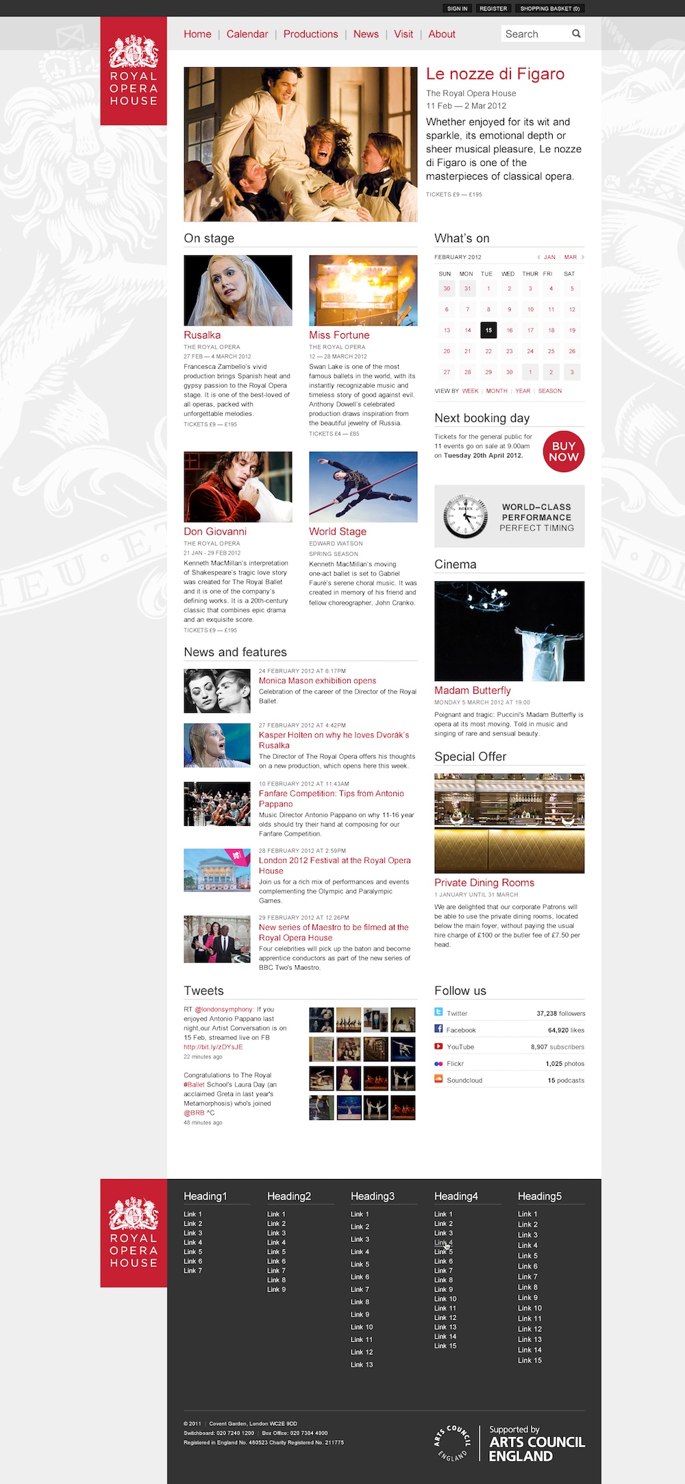
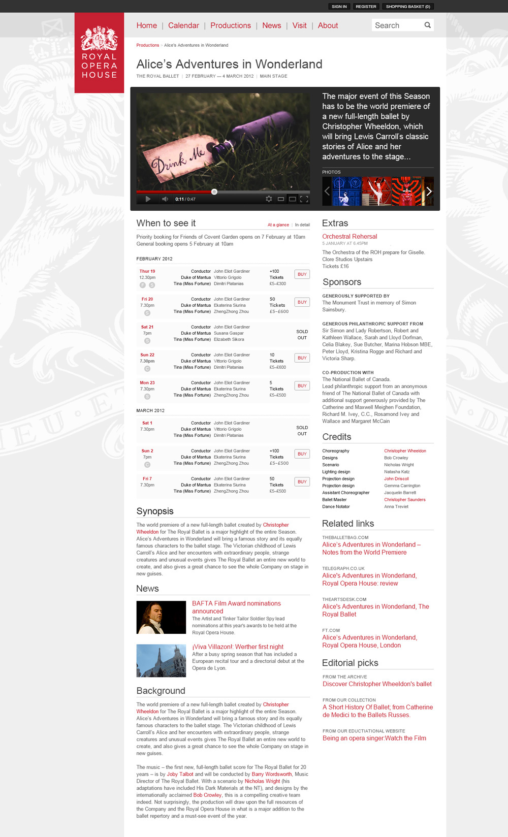
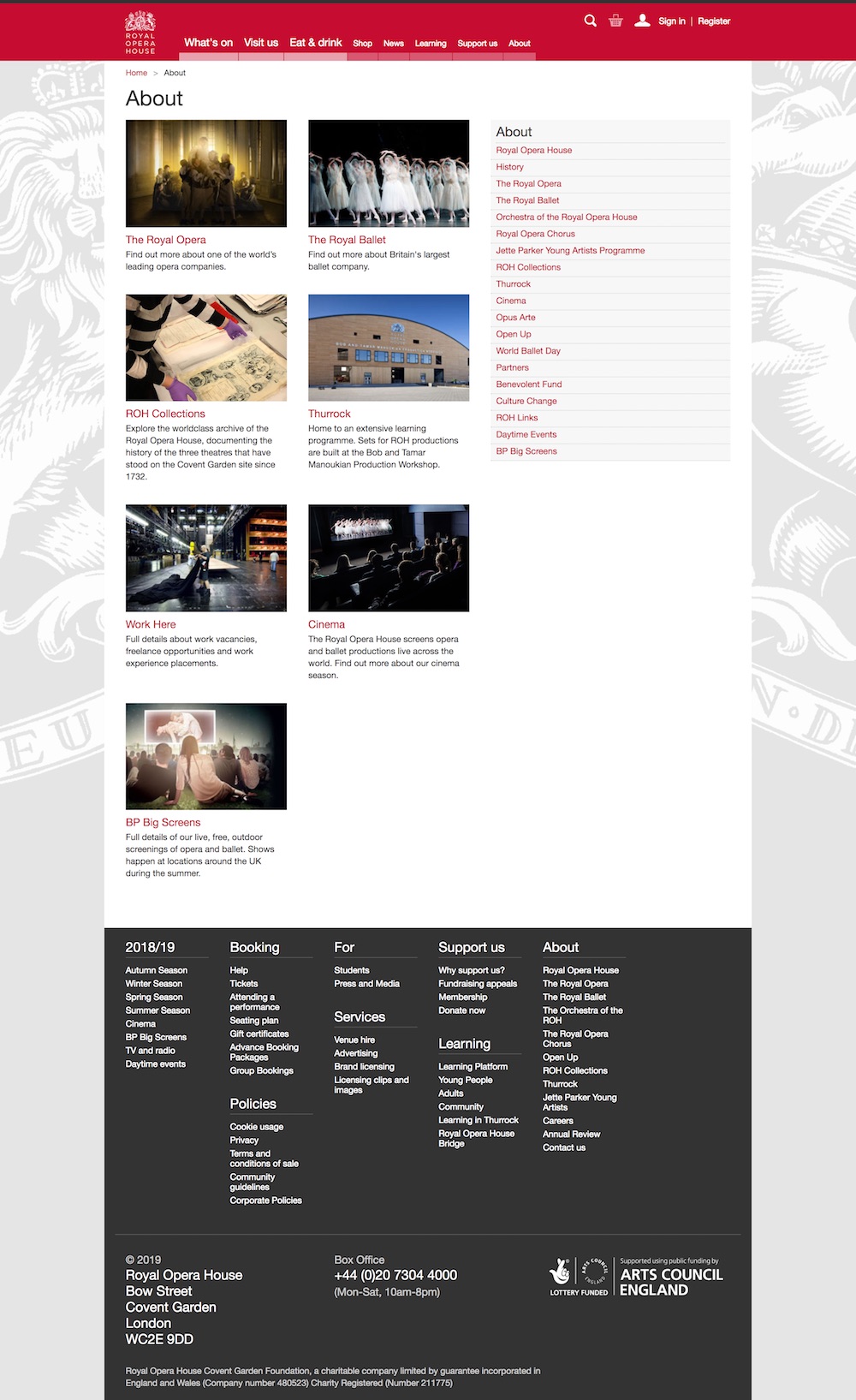
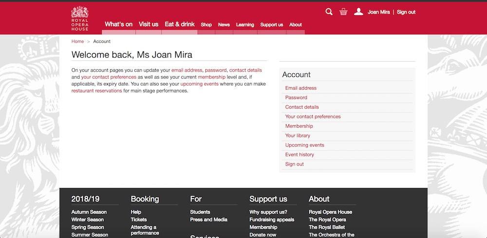
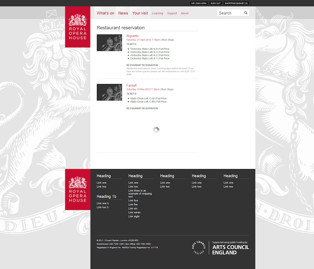
Some screenshots


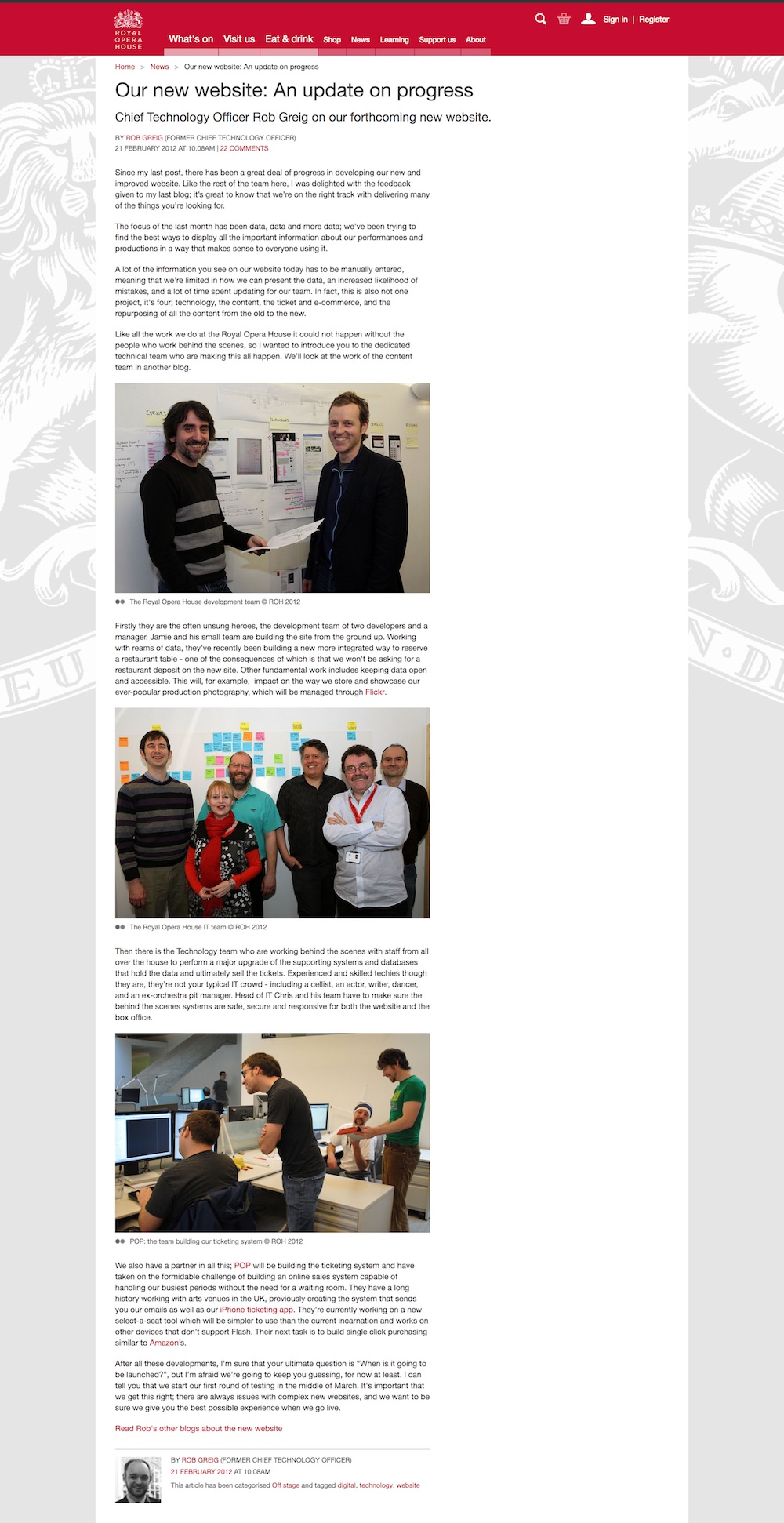
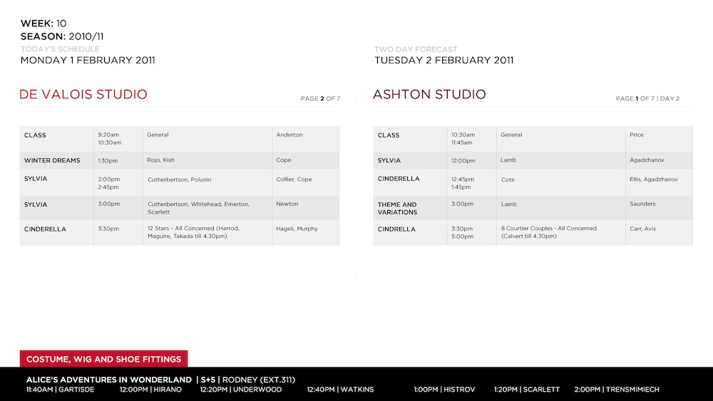
Ballet screens
Another side project I had the pleasure to work on, was the ballet screens. An app that runs on the tv screens of the dancing studios of the ROH. It's an HTML page with some CSS with data coming from an XSLT document.
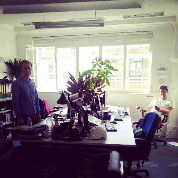
Team and office
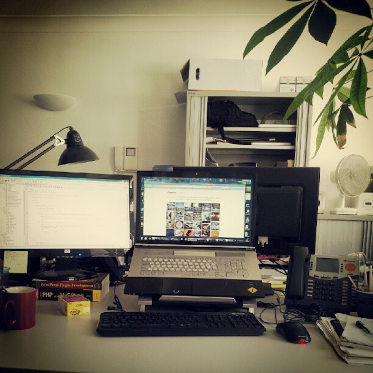
Old design
